Responsive Design
Responsive design goes beyond just thinking about mobile. It's about creating experiences that work across devices and screens. Learn about responsive design and the various approaches to designing for a world with an ever-increasing range of devices.
Back to Categories

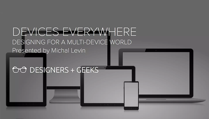
Devices Everywhere: Designing for a Multi-Device World
Michal Levin, Designers + Geeks
People today use multiple connected devices—PCs, smartphones, tablets, TVs, and beyond—switching between them, and using them together in order to accomplish a single goal. Still, most products merely replicate the same experience across devices, substituting solos for what could be an orchestra. In this session, I’d like to introduce ‘The 3C’s”- an ecosystem approach for designing multi-device experiences, one that focuses on context.

Responsive eLearning Design & Development
Geera Bellare & Sonal Sheth, Elearning Guild
Today’s learners use multiple computing/communication devices during the course of the day - for learning, work, entertainment, and decision making. They are on the move, both within and outside the workplace, and want to use their “downtime” effectively. Responsive eLearning helps organizations to leverage this “downtime” while extending the reach and availability of their training.
Like any other approach, Responsive eLearning comes with its own set of planning, design, development and testing considerations and guidelines - and it forces those of us who create responsive eLearning to think beyond just one fixed display size and one uniform use context. Hence, understanding the key features, benefits, types, examples of Responsive eLearning is important in drawing up a strategy that works for your organization. With respect to the strategy, decision factors like when to use responsive eLearning, how to get started and the various challenges you may encounter in the design, development and testing process are crucial to the success of your strategy. Learn about it all in this eBook.

A Mobile World Needs Responsive Course Design
Trivantis
Designing for mobile learners becomes more complicated with each new cell phone and tablet release. However, it doesn’t have to be. Download this eBook to learn more about Responsive Course Design and how you can easily create content that looks great on all devices.

Going Mobile: How to design great multi-device elearning
Paul Welch, Kineo
Having learning that meets the demands of today’s learners by creating responsive, multi-device elearning.

The Definitive Guide to Multi-Device E-Learning
Articulate
Learners don’t just access e-learning from their desktop computers anymore. They’re using all kinds of devices, including smartphones and laptops. That means e-learning professionals are being asked to build courses that work on any device and screen size.
This request comes with a lot of new design and development considerations. How do you create e-learning that’s effective and looks great across multiple types of devices? How do you choose the right mobile learning development tools?
This e-book answers those big questions and more. In this definitive guide, we explain what multi-device e-learning is, break down the approaches to creating multi-device e-learning, and talk through what to consider when evaluating different mobile e-learning solutions.
You’ll also get insights, tips, and tricks for creating multi-device e-learning that you can apply immediately, whether you’re just getting started or want to take your courses to the next-level.

