Design Fundamentals
Instructional designers have to dabble in many different design competencies to create elearning, instructional systems, presentations, and more. Learning design basics is essential to all of them. Get up to speed on the fundamentals of good design.
Back to Categories
Eliminate Nonessential Content
Patti Shank, eLearning Industry
How we write learning content is as important as what we write. For example:
- Complex writing makes the message hard to understand.
- Mixing unnecessary content with important content makes it difficult to find and remember the most critical messages.
In this eBook by Patti Shank, PhD, we concentrate on five critical tactics to remove unnecessary words and content in order to make it content more learnable.

The Fundamentals Of User Experience
Cassius Kiani, Mikleo / Go Highbrow
Change the way you think and look at products (digital and otherwise) forever. Learn what user experience is and how it affects every decision you and your users will ever make.
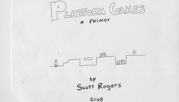
Platform games: a primer
Scott Rogers, Mr. Boss Design Blog
Little Big Planet will turn everyone into a platform game designer - however, it might not make them a good game designer.
So here is a primer on platform games I’ve put together for anyone who wants to make their game a little better or, more importantly, a little fairer. Enjoy!
Just Ask: Integrating Accessibility Throughout Design
Shawn Lawton Henry, UIAccess.com
Just Ask: Integrating Accessibility Throughout Design provides:
- The basics of including accessibility in design projects
- Shortcuts for involving people with disabilities in your project
- Tips for comfortable interaction with people with disabilities
- Details on accessibility in each phase of the user-centered design process (UCD)
- Examples of including accessibility in user group profiles, personas, and scenarios
- Guidance on evaluating for accessibility through heuristic evaluation, design walkthroughs, and screening techniques
- Thorough coverage of planning, preparing for, conducting, analyzing, and reporting effective usability tests with participants with disabilities
- Questions to include in your recruiting screener
- Checklist for usability testing with participants with disabilities
How To Be Creative
Hugh Mac Leod, GapingVoid.com
MacLeod, an advertising executive and popular blogger with a flair for the creative, gives his 26 tried-and-true tips for being truly creative. Each point illustrated by a cartoon drawn by the author himself.
If you’ve ever felt the draw to do something creative but just haven’t been able to pull it together, you’ll love this manifesto.

Hack Design
Hack Design
An easy to follow design course for people who do amazing things. Learn at your own pace. With articles, videos, and tutorials curated by some of the world’s best designers, there’s no easier way to learn design this year.
Flat Design & Colors: Elegant Web UI Design Techniques
UXPin
See the best techniques for using colors & flat design with 40 examples from Google, Squarespace and more.
For flat design, topics include the intersection of Flat & Material Design, pros/cons of flat design, techniques popularized by flat design, flat design resources, and more.
For colors, topics include flat color palettes, high contrast colors, the emotions of color, how to pair color and texture, and more.
Real-world advice on how to stay current with these powerful design techniques.
Essential Guide to Visual Design
Articulate
You’ve heard the old adage, “Don’t judge a book by its cover.” While the most tattered, sorry-looking book can hold delightful, exciting stories inside, we often overlook it in favor of a gorgeously designed hardcover. The same is true about e-learning. Even if your content is Pulitzer-worthy, your learners will find it difficult to be engaged if your course doesn’t appeal to their visual senses.
The good news is that you don’t have to be a visual designer to build beautiful courses. There are five simple ingredients to good visual design: color, contrast, repetition, alignment, and balance. In this e-book, we’ll look at each of these key ingredients and show you how to use them.

10 Principles For Good Design
Principles by Dieter Rams, perpetuated by Vitsoe, reiterated by Oliver Klein., Oliver Klein
Dieter Ram’s 10 principles of good design in website form.
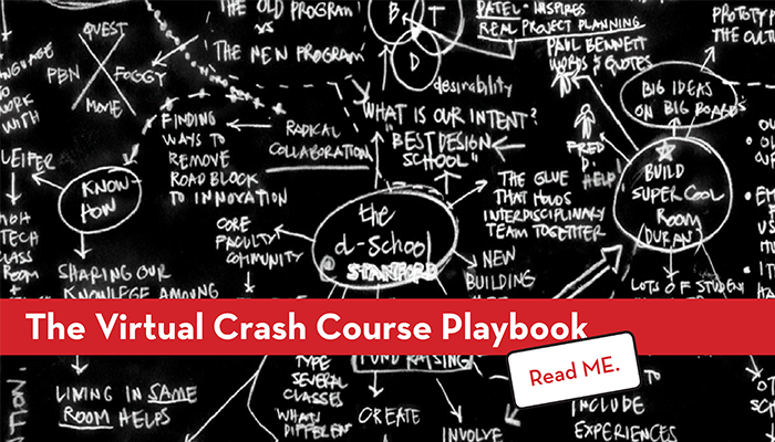
Virtual Crash Course in Design Thinking
Stanford Design School
We know not everyone can make a trip to the d.school to experience how we teach design thinking. So, we created this online version of one of our most frequently sought after learning tools. Using the video, handouts, and facilitation tips below, we will take you step by step through the process of hosting or participating in a 90 minute design challenge.
If you choose to participate, in 90 minutes you will be taken through a full design cycle by participating in The Gift-Giving Project. This is a fast-paced project where participants pair up to interview each other, identify real needs, and develop a solution to “redesign the gift-giving experience” for their partner. NO PREVIOUS DESIGN EXPERIENCE REQUIRED. We’ll provide all the information you need to be successful, whether you are just pairing up with one other person or you are gathering a large group (great for organizations, schools, or companies).
Through this experience we hope you will take away some of the basic principles of Design Thinking and start to adapt them into your personal and professional routines.

